DIGITAL
DATA-
BASE
How do we find visually and typographically
britishness during my time in London?
EXPLORATION- LINES
Research
Conclusion
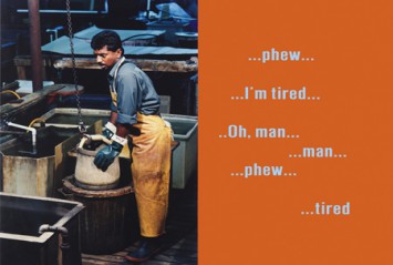
What I noticed during my visit in London that they spend a lot of money on design, almost everywhere we went there was a beautiful corporate identity even in the pubs. The logo's for the pubs are all very classical, they use old looking typefaces and mostly the color gold. Typographically they are very good with instructions for example the "look left" sign, everything is very clear and neat. The subways are amazingly good organized and well thought through. What also stood out was the use of fonts, they use a lot of common fonts and all have the same kinda style, like combining shapes with type.
Over all I think the "design" in London is very well executed.
NOW AND
BECK'S
TIME
What's the difference typographically and visually of the London underground identity and London underground map, now and back then in Beck's time.
Beck's map
Current map
Timeline
logo
undeground
NOW
Type face
New Johnston
Back to the research question
What's the difference typographically and visually of the London underground identity and London underground map, now and back then in Beck's time.
The differences in design is that the current map uses circles and not diamonds for the stations that are linked together. They have expand there tube lines, there are more colors and they are more visible. You can also see the icon for the wheelchair facilities if it's available or not.
They also expanded the legenda and added the website and more information. Of course the paper has changed through the years. There is less place for text in the current design which makes it a little bit unclear.
The current map is more stylistic and minimalistic then the one Beck designed.
SYMME
TRICAL
DESIGN
PORTRAITS ART&
HISTORY
TENT LOGO
DESIGN
Designed by:
pms72
In corparation with:
75b
FURNITURE IN PUBLIC SPACE
KEN
LUM
Kenneth Robert Lum (林荫庭 = Lin Yinting) (born 1956)[1] is a Canadian artist born in Vancouver, British Columbia and residing in Philadelphia, Pennsylvania. He is of Chinese heritage. Working in a number of media including painting, sculpture and photography, his art ranges from conceptual in orientation to representational in character and is generally concerned with issues of identity in relation to the categories of language, portraiture and spatial politics.
Early maps of the Metropolitan and District railways were city maps with the lines superimposed, and the District published a pocket map in 1897. A Central London Railway route diagram appears on a 1904 postcard and 1905 poster, similar maps appearing in District Railway cars in 1908. In the same year, following a marketing agreement between the operators, a joint central area map that included all the lines was published. A new map was published in 1921 without any background details, but the central area was squashed, requiring smaller letters and arrows. Harry Beck had the idea of expanding this central area, distorting geography, and simplifying the map so that the railways appeared as straight lines with equally spaced stations. He presented his original draft in 1931, and after initial rejection it was first printed in 1933. Today's tube map is an evolution of that original design, and the ideas are used by many metro systems around the world.
In 1979 it was redesigned by Eiichi Kono at Banks & Miles and it is still in use.
Who is Harry beck?
Harry Beck, was an English technical draftsman best known for creating the present London Underground Tube map in 1931. Beck drew up the diagram in his spare time while working as an engineering draftsman at the London Underground Signals Office. London Underground was initially sceptical of Beck's radical proposal, an uncommissioned spare-time project, but tentatively introduced it to the public in a small pamphlet in 1933. It was immediately popular, and the Underground has used topological maps to illustrate the network ever since.